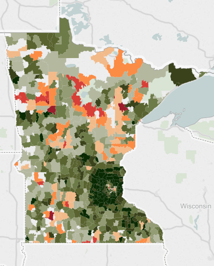
Eric Anondson: MN Distressed Communities

streets.mn:

This is really fascinating to see visually and might even fit with many assumptions of what particular areas of the metro area are like. Go mouse around the interactive map at the link above, the zip codes reveal the statistics for each zip code.

But I had one particular issue that I couldn’t shake. The zip code map of Minnesota’s distressed communities had a worrying similarity with another map I posted about a few weeks ago. The Minnesota Carbon Donut. I immediately thought of the famous XKCD comic on heat maps. The map of economic distress correlates quite closely with the carbon footprint ring. Huh? I’m going to have to dwell on that a bit more, but I think how closely they match up deserves some attention.

People Post Pictures of Clear-Water Lakes More Than Turbid Lakes

Roberta Kwok, writing for Conservation Magazine:

Shutterstock

Shutterstock

People were more likely to visit bigger lakes with clearer water, the researchers report in Frontiers in Ecology and the Environment. For every additional meter of water clarity, visitors drove nearly an hour longer to get to and from the lake, spending about $22 more in travel costs. Lakes with boat ramps also were more popular.

The study authors estimate that improving a lake’s clarity by one meter would bump up the average number of visits by 1,389 per year. The overall number of lake visits in a region might not increase, since the number of people travelling to the murkier lakes could drop. But if people opted to visit a lake rather than, say, a pool, the total number of visits could rise.

Recreational demand for clean water: evidence from geotagged photographs by visitors to lakes By Bonnie L Keeler, Spencer A Wood, Stephen Polasky, Catherine Kling, Christopher T Filstrup, and John A Downing